
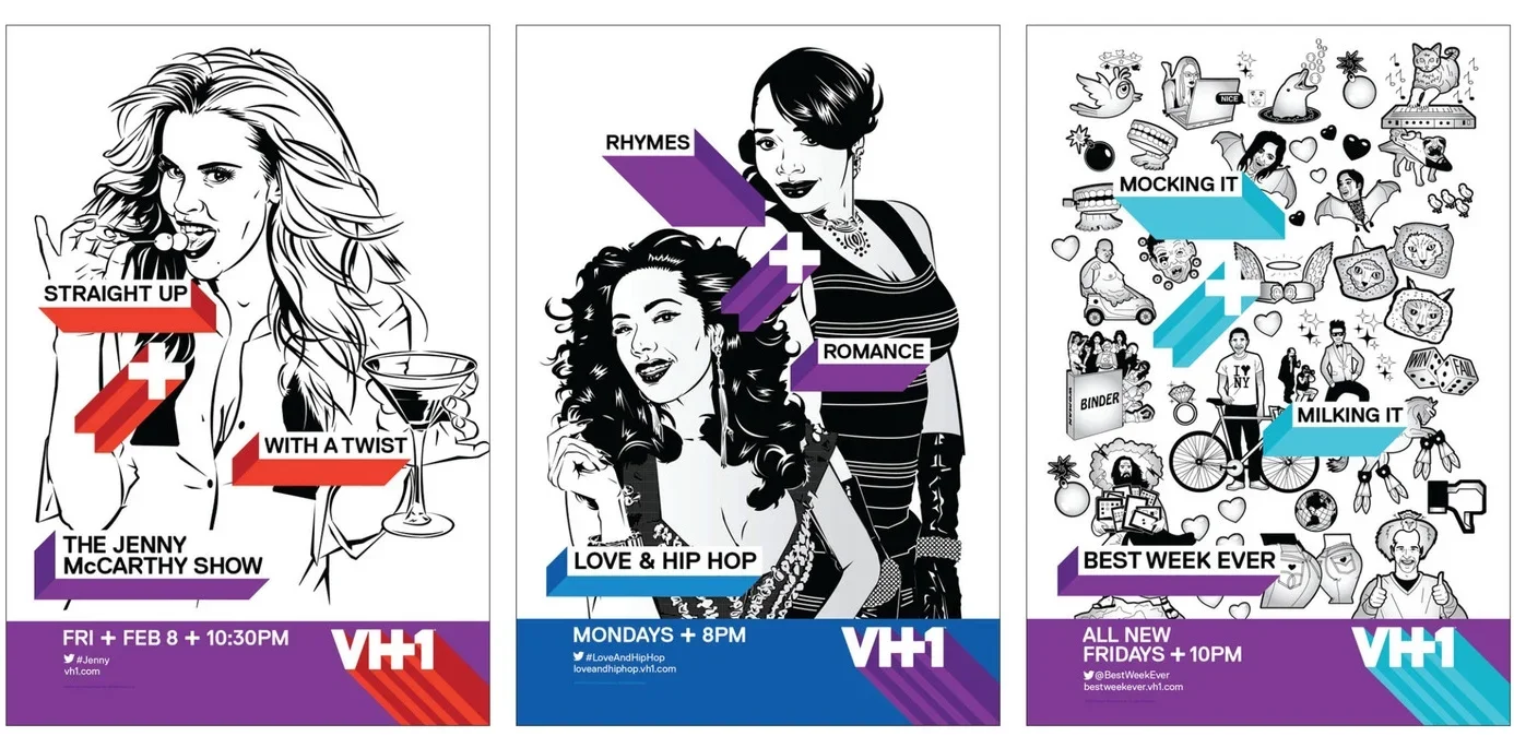
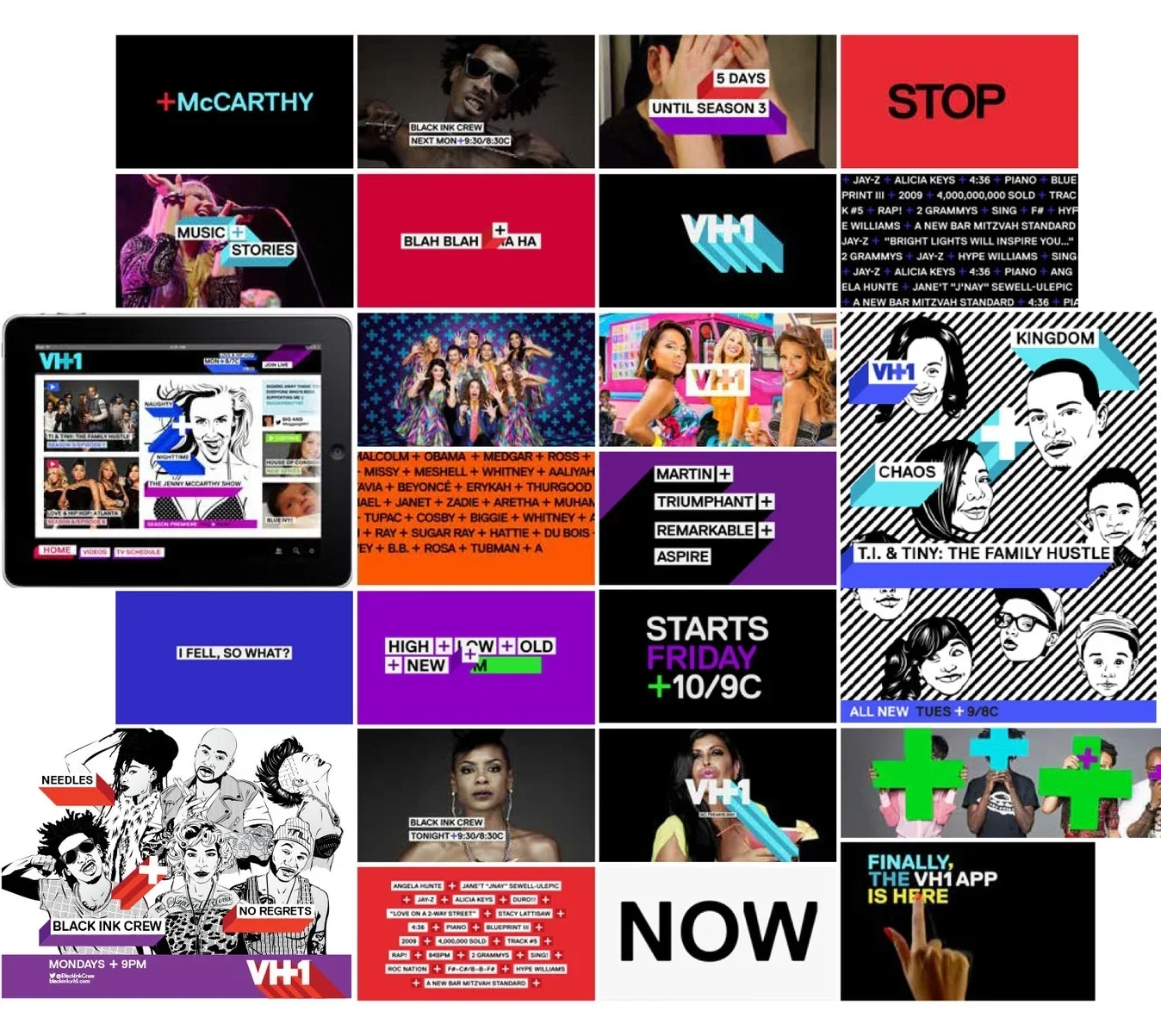
In 2013, on the heels of a year that generated a 33% increase in primetime ratings, VH1 underwent its first full-channel rebrand in over a decade. The goal was to develop a new visual identity and style of language that reflected the network’s bold, buzz-worthy mashup of music, pop culture and nostalgia – and use it as a launching pad for a slate of new comedy-based programming and returning reality hits.
PromaxBDA Gold & 2 Bronze
VH1 REBRAND
CREATIVE DIRECTION: VH1 Creative Team
•
Gretel
•
ILLUSTRATION: Quick Honey
•
PHOTOGRAPHY: Piotr Sikora
•
CREATIVE DIRECTION: VH1 Creative Team • Gretel • ILLUSTRATION: Quick Honey • PHOTOGRAPHY: Piotr Sikora •

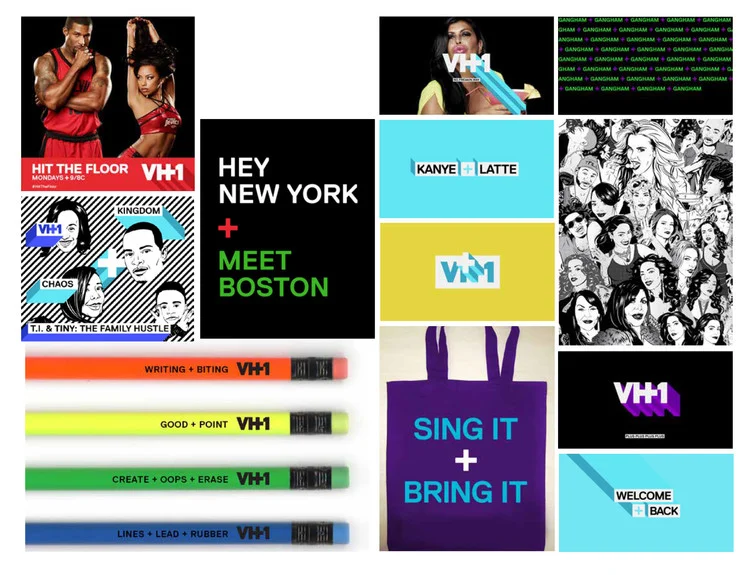
The centerpiece of the VH1 rebrand was the new logo with an embedded plus sign – reflecting VH1’s steroid-laced form of entertainment and mash-up of unique pop culture ingredients. The brand voice used the plus to talk to the viewers in a fun abbreviated shorthand, echoing their own way of talking around the dawn of Extremely Online Internet culture.
THE PLUS
Writing taglines within this new copy system was a journey I won’t soon forget.
SERIES KEY ART
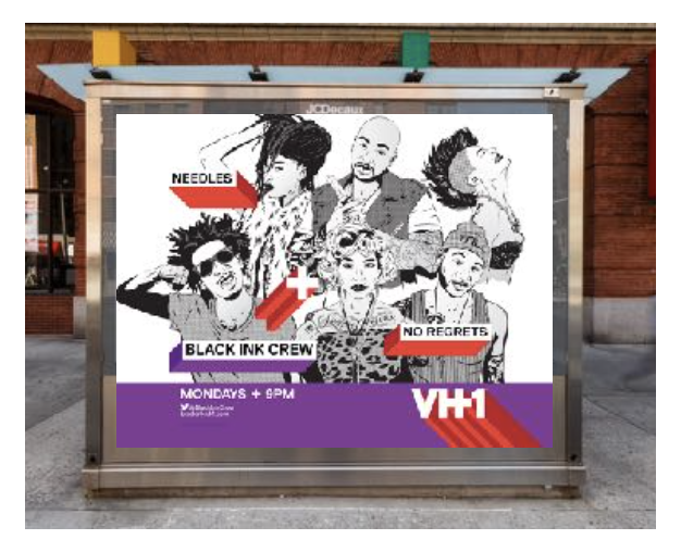


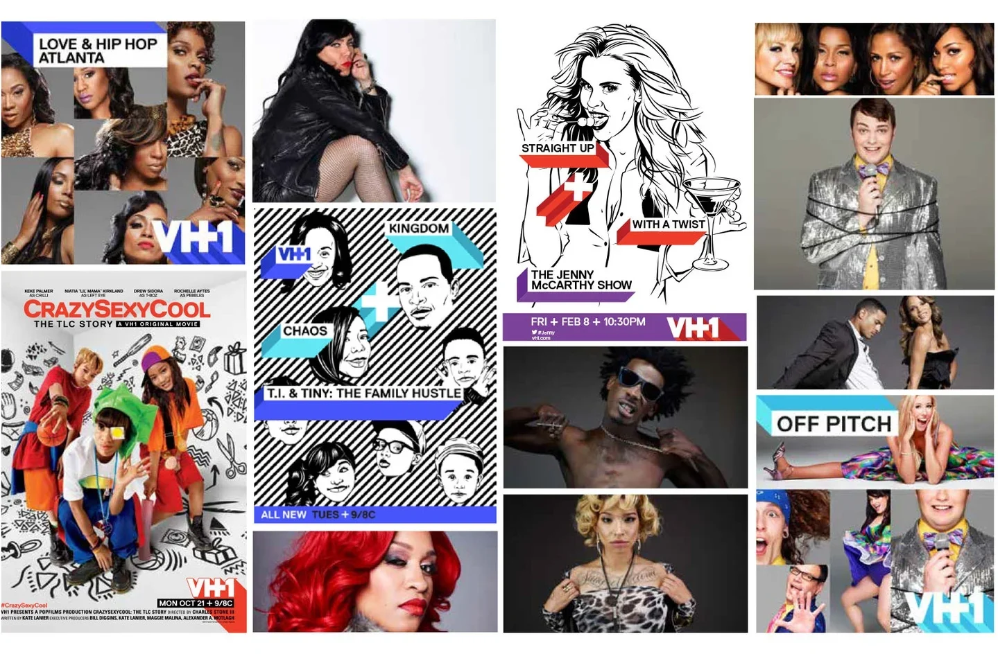
The logo, the language, the bold pop illustration and vibrant color palette formed the totality of the new VH1 brand identity.
STYLE GUIDE SWIPES


SOCIAL & ON-AIR INTERSTITIALS
It’s unclear to me whether these ever saw the light of day, but I’m still real proud of my bacon joke.


